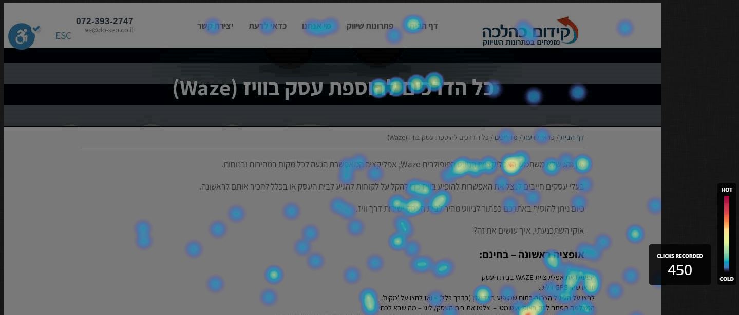
A site heat map is a very useful tool to know which areas and places on the user’s site are the longest. Which pages attract more surfers and vice versa, which pages do not visit at all.
The heat map appears in dark or light colors accordingly. If the areas are more surfing – the colors will be red, if the areas are less useful they will appear as bright and cool as blue or light blue.
Effective methods for checking the behavior of users on the site:
Mouse – A heat map through which you can see where the user has moved his mouse around the site. If we see that the users have moved with the mouse mainly on the home page and the other pages do not have very few visits or visits, then the information contained on our homepage is probably not attractive enough or incomprehensible, so it is necessary to refresh the content and improve visibility so that we can attract the visitor to our site And “walking around” the various sites on the site. On the other hand, if we see that users are moving the mouse over “dead” areas of the site – we should add some information there that can help us with conversions if needed.
Clicks – a heat map where you can see where the clicker site is located. For example, in various landing pages that we set up, the main goal is to target the user and give him brief and informative information so that he can click on the Leave Details button and thus increase our conversions. If we go to analyze a landing page that didn’t accrue a lot of conversions and see by the heat map that the clicks were in other areas other than the dedicated button, we understand that the button needs to be changed and moved to a different location, preferably to the one most clicked.
Scrolling – Using a heat map that checks the user’s scrolling data on the site you can know and understand what should be improved or left on the site. The heat map will show the darkest color, especially in the upper area of the page by half – which is the most ideal and correct place for optimization. If you see that most surfers scroll to the end of the page and the hot areas are at the end, they may not be able to find the information they are looking for at the beginning and so it is necessary to improve the page and change the order of things.
Site map heat benefits:
As we examine and analyze the behavior of the surfers using the heat maps on the site we can know what things we can improve to optimize our site.
Because we want the surfers to go to the site, find what they are looking for, and make a purchase if necessary, we recommend using heat maps to do this.
Sounds great? Obviously..
My recommendation is to use HOTJAR’s tool, they have a free version designed for small websites (even large ones can ..), their free tool gives a number of tracking capabilities to the site:
*Get Inquiries from Users: This can be used for feedback, lead form, survey, etc.
*Heat map up to 3 pages.
*Record browsing up to 100 recordings.
*Sales funnel tracking – Find out where people are abandoning the buying process.
*Track Form Fillers.
Need help installing the tracking and training in using the system? Talk to us ..


